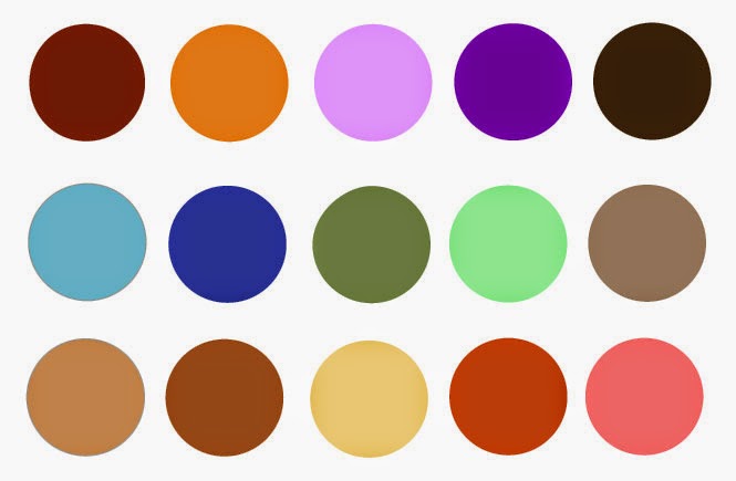
Time for some color inspiration! What colors best describe you or your business and attract the audience you seek?
From The Complete Book of Color (a long time favorite on my bookshelf):
Red- active, passionate
Orange- creative, joyful
Yellow- positive, uplifting
Gold- wisdom, abundance
Pink- love, kindness, hopefulness
Green- nature, comforting
Blue- tranquil, peaceful, trustworthy
Purple- spiritual, creative
White- classic, spiritual, expansive
Black- serious, professional
Brown- stability, supportive
Silver- balancing, sensitive
Pastels- soothing, caring
Brights- vibrant, creative
Earth Tones- grounded, eco-friendly
There’s no question color has an effect on us in everything from gift and paper products to interior design, fashion and advertising. Notice how you feel when you wear different colors or which colors stand out to you when shopping or surfing the internet.
According to Pantone, “Colors can stimulate, excite, depress, tranquilize, increase appetite
and create a feeling of warmth or coolness. This is known as
chromodynamics.” The first thing I usually ask my design clients before selecting colors is what feeling do you want to convey? What color descriptions above match that feeling?
For the web, managing eye fatigue is an important consideration when selecting colors too. It’s slightly harder to read light-colored text on a dark background than dark text on a light background. Bright-colored text is also harder to read on a screen. Try a light or bright color as a subtle design accent on a neutral background paired with dark text to achieve the same color effect.
For art, design or handmade products, it’s important to allow your work to be the main visual image. Use color as a subtle accent in advertising or packaging. For example, I placed a light teal in the header and a red stripe in my logo to bring in a hint of color. Vibrant one or two color logos work well for designers. If you’re a fine artist, a simple signature may be a great option for your logo along with large images of your work. Consider using your name in a distinctive font that could be printed in either a color or black and white version. Use the same set of colors and fonts across all of your branding such as business cards, product packaging, ads, website and email newsletters. A distinct graphic identity will establish your brand presence.
Here’s a fun online tool for designing color schemes: Paletton. Choose one color and see what it looks like paired with shades, complementary colors and more.
And more of my favorite color resources 🙂
Color Marketing Group
Pantone Color Trends
Psychology of Color
COLOURlovers


